 |
New York
Architecture Images- Midtown Conde Nast Building |
|
architect |
Fox & Fowle Architects |
|
location |
4 Times Square at Broadway |
|
date |
Construction started in 1996 and ended in 1999 |
|
style |
Post-Modernism |
|
construction |
Height to the top of spire: 866 ft (264 m), 48 floors |
|
type |
Office Building |

|
  |
|
|
|
  |
|
|
images |
|
  |
|
 |
|
  |
|
  |
|
 |
|
 |
|
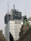
| The Condé Nast Building, a
48-story office tower, is the centerpiece of the 42nd Street Master Plan
prepared by the 42nd Street Development Corporation, a public/private
consortium created to promote the redevelopment of this traditional heart of
Manhattan.
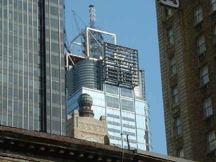
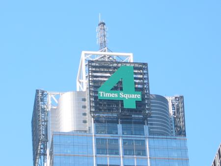
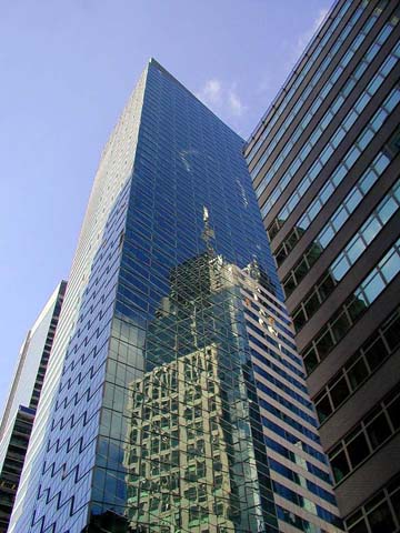
The office tower has two orientations: on the side facing Broadway it takes on the character of Times Square and its active and dynamic environment, and on the side facing 42nd Street it takes on the more sober characteristics of the mid-town Manhattan business community. The building top reflects the principal structural support system, and it expresses in a high-technology style the project's location at the intersection of Broadway and 42nd Street-"The Crossroads of the World." In an article in the New York Times, Herbert Muschamp wrote, "The tailoring of form to context is one of the strengths of buildings designed by Fox & Fowle. That talent gets quite a workout here, in a design that tries to relate the building to the bright lights of Broadway and the masonry cliff bordering nearby Bryant Park. It excels as a piece of urban theater, with a cluster of neon signs at the base and an eruption of high technology hardware popping out of the top." The Condé Nast Building is an environmentally responsible building. All building systems and construction technology have been evaluated for their impact on occupant health, environmental sensitivity, and energy reduction, making Four Times Square the first project of its size to adopt state-of-the-art standards for energy conservation, indoor air quality, recycling systems, and the use of sustainable manufacturing processes. The building features environmentally efficient gas-fired absorption chillers and a state of the art curtain wall with excellent shading and insulating performance. The air delivery system will provide 50% more fresh air than industry codes, and a network of recycling chutes will serve the entire building. Stringent procedures have been followed during construction as well as in the day-to-day operation of the building in order to maintain these standards. A comprehensive set of tenant guidelines has been developed as well. Special thanks to www.wirednewyork.com |
|
|
notes |
Acing
the Deuce Fox & Fowle transformed 42nd Street by defying convention with exuberant Times Square towers for Condé Nast and Reuters; visionary architect Lebbeus Woods finally gets his due. BY JOSEPH GIOVANNINI Multiple personality in a building is not a disorder but a quality, especially when it comes to Times Square, where, as they say, worlds cross, and the scissoring avenues cut open the street grid, releasing geysers of urban energy. Erupting with people, signs, cabs, hotels, theaters, restaurants, offices, subways, and buses, Times Square resists fusing into a single, settled form and identity. Chaos is glory. Different Strokes: Fox & Fowle gave both 3 and 4 Times Square multi-textured façades. But how does an architect take that state of perpetual disequilibrium and turn it into a building? What kind of high-rise really fits in this anti-classical context? Several years ago, New York architects Fox & Fowle offered the first credible reinterpretation of Times Square: the Condé Nast tower at 4 Times Square. Channeling the multiple personality of Times Square, the architects broke down the massive 1.6 million-square-foot tube, layering together a composite building of many parts that perform different roles in different directions. Along Broadway, the kinetic signage spells entertainment, but around the corner, on 42nd Street, the dressed stone means business. The top of the building, with a high-tech radio spire, salutes its neighbor, the Empire State Building, while the base caters to pedestrians. Fragmenting the box so that the building isn't a solid cornerstone but an indeterminate mass dissolving in its own reflections, the architects surf and retransmit Times Square's energy. Developed by the eco-friendly Durst Organization, one of the rare architectural patrons working at this commercial scale, this hyperurban location has been turned by the architects into an ecologically responsible environment whose air quality inside rivals rural Vermont's. The architects have followed up their Condé Nast success on the opposite corner at 3 Times Square with the new Reuters Building, where, by an informal count, there are some six or seven buildings rolled up in a single tower, all with different façades that blend into, and add to, the diversity of Times Square. With a two-story granite-faced store, a neon marquee pointing out the subway entrance, a drumlike structure with terra-cotta columns turning the corner, and a curved glass wall sailing high between gridded façades, the 850,000-square-foot building changes top to bottom, side to side, front to back. In the upper reaches, the sail rounds the front Seventh Avenue façade, opening up Times Square to 42nd Street, borrowing needed space and featuring the dynamically splayed corner of the next high-rise going up across the street. Inside, the curved façade fans the upper floors toward the southern views, and interior architects Swanke Hayden Connell draw the signature curve back into office layouts. Edwin Schlossberg has mounted huge LED signs on the northeast corner of the building and inside the monumental lobby, and information flows past the door into the building. The building fits seamlessly here because Fox & Fowle has opened the normally closed skyscraper form to a part of the city that's already layered in short and tall, new and old buildings. The Reuters Building does not strive to be a perfect whole but is a fuzzy, indeterminate figure that blends into a context from which it takes its cues. The concept is best understood from the Port Authority Building at Eighth Avenue and 42nd Street, where, in a kind of spatial collapse, the Reuters and Condé Nast buildings merge into a single composite of some twenty apparent buildings, as in a Renaissance veduta -- those scenes once imagined by architects clustering disparate buildings into the same view. Manhattan has many twinned buildings on opposite corners that perform as uptown-downtown gateways, but Reuters and Condé Nast here act as fraternal rather than identical twins. The idea of a building collaged from many parts may not be original to this project, but it is original and appropriate within Times Square. Developed by Reuters and the Rudin Company, the Reuters Building does not pander, like the entertainment architecture down 42nd; it does not patronize the area, like the mansarded buildings Philip Johnson proposed for the same sites in the eighties; and it does not hide behind a mask of signs. At night, the lighted windows may reveal that the building is basically a generic tower wrapped around an elevator core, but by day the commotion and movement of this omnidirectional building sustain the tumultuous urban performance along the street. The design is not a one-liner but rather deft architecture that shows seismographic sensitivity to its dynamic context. Reuters is doing a riotous break dance with the city. Cultural politics in New York can be rough on talented architects. Our resident visionary, Lebbeus Woods, has long been the victim of a strange institutional silence. His haunting utopian and dystopian visions of cities have earned him cult status around the world (even though the visions are unbuilt), but no major institution here has ever mounted a one-man exhibition of his work. A current show, "The Storm," redresses the slight and transforms a heretofore in-house secret, the Cooper Union's Arthur A. Houghton Jr. Gallery, into a daring institution at a time when major Manhattan venues have produced only self-canceling group shows or safe architectural retreads about dead masters. The corridors leading up to the main exhibit on the architecture school's second floor are lined with samplings from his distinguished career. He has regularly conceived rambling high-tech-biotech structures steeped in a fearful asymmetry -- Jules Vernesian worlds updated to the twenty-first century that drift in the air or escape from war-ravaged structures. His brilliant drafting technique matches the vision and, in a way, produces it: He thinks with his fingers. The show's main event, an installation, spins into real space a thesis about space. An abstract mural depicting relatively controlled geometrics shoots off wires that are held together, and apart, by red batons, like a jet stream of visible forces that encounters a second vector of wires emanating from a vortex drawn on an adjacent wall. The two forces hit and scatter mid-gallery into a dense field of lines and batons that flow toward a third wall, where the three-dimensional construction collapses back into a final mural with abstract shapes exponentially more complex and disturbed than the originals. The sum of Woods's vision is a critique of buildings based on the Euclidean verities (which is to say nearly all buildings). This is a line drawing that presents the calculus of change in a constantly shifting space. Woods proposes architecture conceived outside the geometric box and makes the idea here poetically elegant, physical, and real. From the January 21, 2002 issue of New York Magazine. |